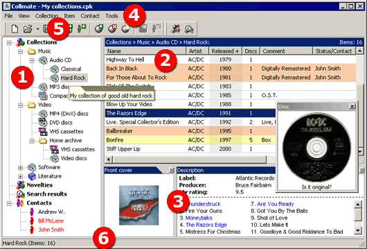
The package tree is used for navigating through elements of the current collection package. There are five main sections in the tree:
Collections. This section contains collections and items in the form of a hierarchical structure where any collection can contain an unlimited number of items and subcollections.
New Items. This section contains the list of items from all collections recognized as new according to the parameters of the list of new items.
Search Results. This section contains the list of items matching the search criteria and found in the current package.
Contacts. This section contains:
- the list of people who loaned items from your collections;
- the list of all items absent from your collections;
- the lists of items loaned to each person.
Depending on the section selected in the package tree, the list of items contains:
- items in the selected collection;
- new items in the current collection package;
- items matching the search criteria;
- items absent inform the collection (loaned).
The structure and number of columns in the list also depends on the section selected in the package tree. For example, the list of loaned items has a column with the date when each item was loaned. The structure and order of columns can be modified in the Collection properties dialog box.
The list of items can be sorted by any column (if it is the list of collection items the order of sorting is remembered).
Additional information (details) about an item includes:
Up to 4 pictures (with individual comments). All pictures are shown in their reduced size. To view an image in its actual size, double-click the reduced picture;
Other attributes that are not displayed in the list of items. Such attributes are the individual attributes of an item hidden in the list of collection items or all its additional attributes if the current list of items is not the list of collection items (e.g. novelties);
Text description (the size of the text is not limited). To edit the description, open the Item properties dialog box or double-click the text of the description.
The way the item details panel is displayed can be adjusted by the commands from the View menu of the main menu.
Main menu (4)
The main menu of the program is the standard element of the graphic interface in most Windows applications. The structure and commands of the Collmate main menu are described in the Collmate main menu section.
Toolbars (5)
Toolbars contain buttons representing the most frequently used commands of the main menu. This makes working with Collmate easier. You can position toolbars where you want or hide any toolbar by using the commands from the View menu of the main menu.
Status bar (6)
The status bar is another standard element of the graphic interface in most Windows applications. In Collmate, it is used to display additional information about collections and items and hints for the commands of main menu (4) and the buttons on toolbars (5).
See also